1. Introduction
What is CartoDB?
CartoDB is a web-based service you can use to create and host maps based on datasets you upload. The basic service is free, although a paid account allows you to host private maps and use various additional features.
What skills do I need in order to use CartoDB?
You’ll probably need a basic working knowledge of a spreadsheet application like Microsoft Excel, LibreOffice, or Google Sheets. Some basic SQL, HTML, and CSS is very helpful. Having advanced technical knowledge (especially frontend development) will greatly extend the range of things you can do with CartoDB, but it’s not required.
What is the purpose of this tutorial?
This tutorial will explain how to map election results using CartoDB. Much of the material will also be applicable to other kinds of maps.
How much do you know about CartoDB, and mapping software in general?
Not much at all. My only reason for writing this tutorial is that much of the official CartoDB documentation is written for audiences with a good deal of technical knowledge – more knowledge than you actually need to have in order to begin using CartoDB. Also, I’m not aware of any tutorial geared toward this specific type of map, which is of interest to many people. It is possible that some of the following advice is wrong, or that I have overlooked easier ways to perform some of the following tasks. If you think this is the case, let me know and I’ll update the tutorial.
2. Preparing your data
In order to create an election map, we need two kinds of data:
- A table of election results for whatever geographical units we want to map – in this case, precincts - and;
- Geospatial data we can use to map the locations and boundaries of those precincts.
Where you can get these things – and indeed, whether you can get them at all – will unfortunately vary depending on the election and the jurisdiction. The example we’ll be using here is the 2016 Democratic presidential primary in Bernalillo County, New Mexico, where Albuquerque is located. (I mistyped the name of the county early on, and the mistake propagated to every screenshot. If you’re from there, try to disregard this.)
Election data
Election data may be available from the city or county election board website, or from the state’s Secretary of State website. Precinct-level election results for New Mexico are available from the New Mexico Secretary of State. Here are the particular results we want. You’ll notice that we can export them as a spreadsheet, which is what we’ll do. (In some cases, you can only download them as a PDF, which wouldn’t work for us.)
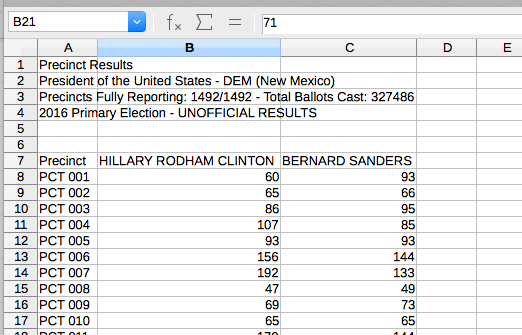
These results are in a simple and usable format, which is one reason I chose a New Mexico county as an example. In order to upload these to CartoDB, we’ll want to delete everything except the data itself and the column headings. Also, we want to map vote percentages, not the raw numbers of votes, so let’s add a few more columns:
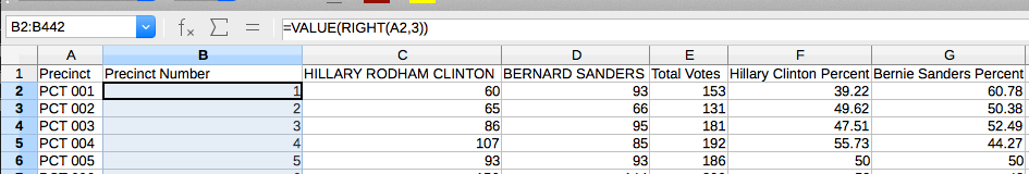
I also added a “Precinct Number” column that contains only the precinct number itself, rather than “PCT xxx” – the reason will be apparent shortly.
We could also create these new columns within CartoDB, but we’d have to use SQL, and I assume that spreadsheet programs are familiar to more people than SQL is.
Once we upload this table to CartoDB, the order of the columns will be lost, and all characters except for letters, numbers, and spaces will be removed from the column names. Thus, you should make sure your columns all have descriptive headers that don’t use any special characters.
We’ll save the spreadsheet in CSV (comma-separated value) format. Other formats will work, but some content may be lost; using CSV (which is the simplest possible format for tabular data) will avoid confusion.
Geospatial data
If we were mapping data associated with individual points on a map, we could just add latitude and longitude columns to the spreadsheet, and CartoDB would plot the points. However, we want to fill in shapes on the map, so we need vector data.
CartoDB can use vector data in several different formats:
- Shapefiles
- KML or KMZ files
- GeoJSON
The beauty of CartoDB is that you don’t really need to know how these files work or what they contain, and for our purposes here they’re basically interchangeable. The one relevant difference is that in order to use shapefiles, you need a set of several files with different extensions. CartoDB requires you to combine them in a single zip archive, which is often the form you’ll find them in anyway.
Cities and counties will often have data portals or GIS websites where you can download these files – for example, see this data for Chicago or this data for San Francisco. Even if they’re not available online, the government probably has them; if you have press credentials or are feeling bold, you could call them and ask.
Failing that, try Google. In this case, I was able to find them on Data.gov. We’re going to use the shapefiles (in ZIP format), because the KML doesn’t have all the information we need in this case.
3. Importing your data
Now that we have all the data we need, we’re ready to upload it to CartoDB. Once you’ve registered or logged in, click “Datasets” and then “NEW DATASET”:
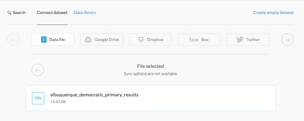
Hit “CONNECT DATASET,” wait a few moments, and our spreadsheet is now an SQL table:
It doesn’t have any mapping information yet, so let’s do the same with the zipped shapefiles:
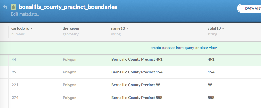
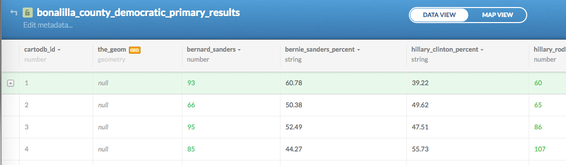
This table has lots of columns, most of which I’m not showing you. Two in particular are important here. The first is the_geom, which contains the shape we’re mapping, although you can’t see it in this view. The second is vtdst10 – I have no idea what the name means, but this column contains the precinct number.
We can use the precinct numbers to combine this table with the election results table, and thus associate the vote totals with the map data. However, the precinct number on the election results table has the datatype number, while the one on the shapefile table is a string column – that is, it’s actually storing a text representation of the number and not the number. Even if it looks the same to us, CartoDB won’t recognize it as being the same. Fortunately, we can change this:
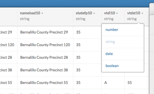
CartoDB will warn you that unconvertible data will be lost, but since the contents of that column are all numbers, they’ll convert just fine.
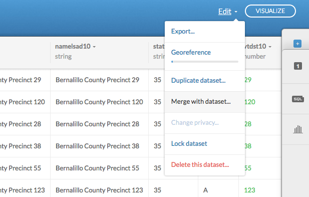
Now we can merge the datasets:
Choose “Column Join,” select precinct_number and vtdst10, and you can choose which columns to use:
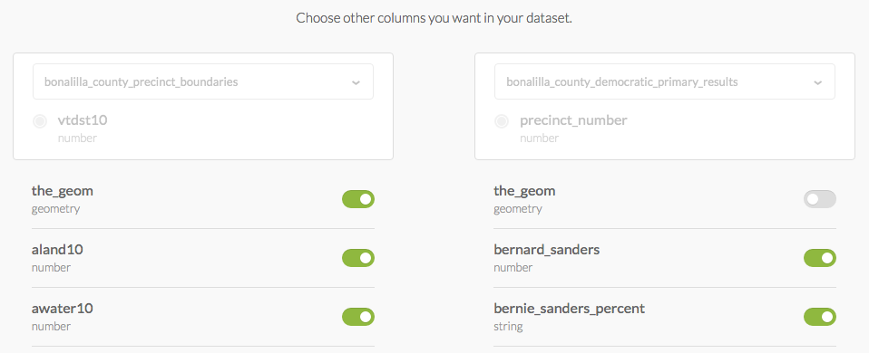
Make sure the_geom is coming from the shapefile dataset, but other than that, you may as well keep them all. Merge the datasets.
Note that the exact steps you need to follow will differ depending on the exact format of the datasets. The important point is that both tables need to have a matching column.
For now, click “MAP VIEW,” and you’ll see that the precinct boundaries are all here:
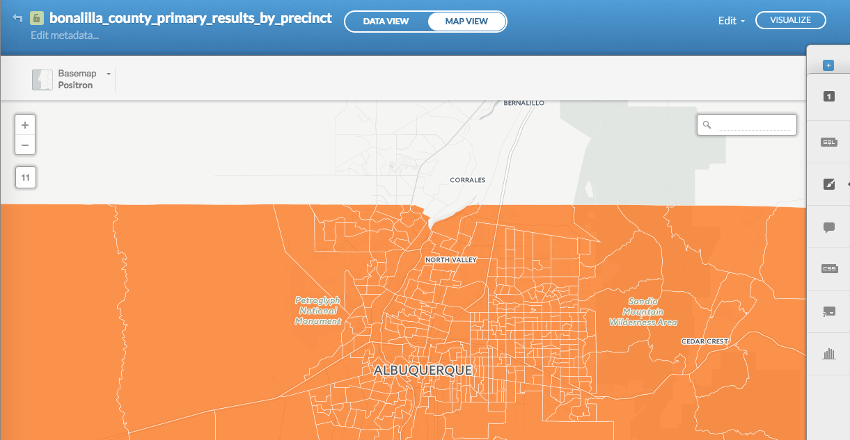
However, we haven’t told CartoDB how to display the election results yet.
4. Visualizing your data
At this point, I’ll click “VISUALIZE” and create a map. We don’t really need to do this until later, but it’ll make some useful export options available.
Click on the “CSS” tab on the right-hand menu, and you’ll see the styling rules that CartoDB is using:
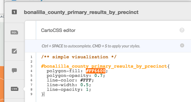
You may or may not be familiar with CSS, but it’s pretty clear what this is doing. The polygons are colored bright orange (#FF6600), are 70% opaque, and are surrounded by white (#FFF) borders with thickness 0.5.
We want to make the styling reflect our data. Click the paintbrush to take a look at the CartoDB wizards, and you’ll see that there are some built-in options for doing this:
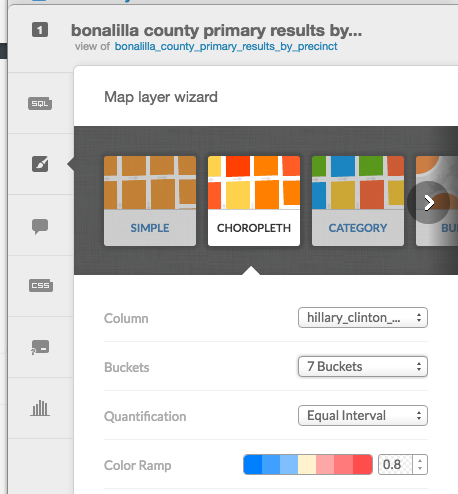
There’s a wizard for creating choropleths, which is the type of map we want to make. We can use any numeric column. If we convert hillary_clinton_percent to a number, select it, and pick a diverging color scheme, as above, we’ve already got an election map:
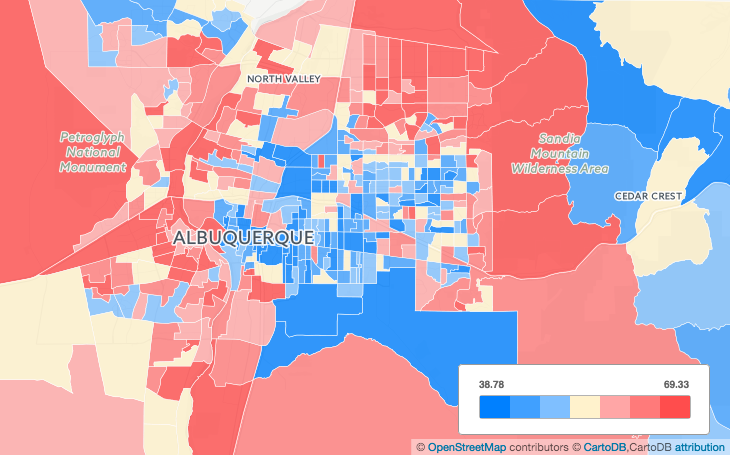
Not bad! But there are some issues here. The color mapping isn’t quite symmetrical – a dark blue precinct has a smaller Sanders margin than the Clinton margin in a dark red precinct, and although the center point is pretty close to 50%, it’s a bit off. This is because CartoDB has no idea what these numbers actually mean - it doesn’t know that 50 is an important number when mapping elections, or that Clinton +10% and Sanders +10% should look equivalent in some way.
Also, the color scheme options are limited. We can’t use more than 7 buckets, and the only two diverging color schemes are red/green (which we don’t want to use because some people are colorblind) and red/blue (which we also don’t want to use in this case, for symbolic reasons).
(A bit of an aside here: typically, when mapping quantitative data in a choropleth like this, you want to use a sequential color scheme. Using a diverging scheme, with two colors, implies that there’s something special about the center point. In a two-candidate election map, there is – the 50% mark determines which candidate wins. But if the center point is just whatever the average happens to be, it’s misleading.)
So let’s go back to the CSS panel and take a look at what CartoDB is actually doing:
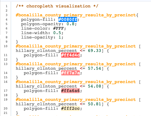
The rules in brackets are conditionals. If that rule applies to a polygon, the styles within the block are applied to that polygon. So if hillary_clinton_percent is less than or equal to 69.33, the polygon will be colored #ff4d4d, or bright red. If hillary_clinton_percent is less than or equal to 57.54, it will be colored #ff7a7a, or lighter red. And so on.
There are a few important things to understand about these rules:
- Any rule that applies to a polygon will overrule all earlier rules it contradicts. In this example, if
hillary_clinton_percentis 55, both of the first twopolygon-fillrules will apply – but the second one will overrule the first. However, if a later rule changed a different property, likepolygon-opacity, it would not affect the earlier rule. - You can only use simple comparisons (
>,>=,=,<=,<) against a single database column. So you can’t, for example, use[hillary_clinton_percent > bernie_sanders_percent]or[(hillary_clinton_percent / 100) > 0.5]. - I don’t think there is a way to nest conditionals or use multiple conditionals on the same block. Hopefully someone will correct me if I am wrong.
In the simplest case, we could just do this:
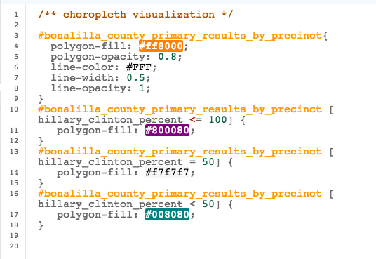
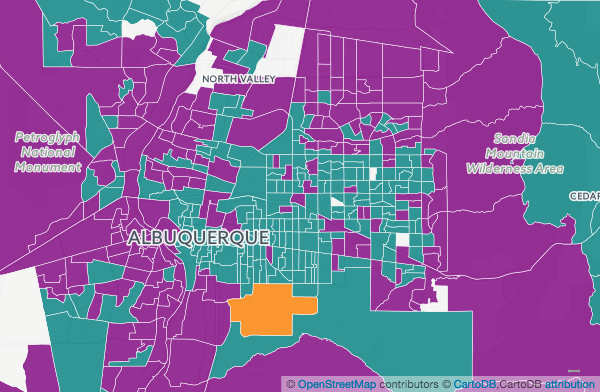
Now we can see which candidate won each precinct. This also brings up another issue. I could’ve just made purple the default color, since Hillary Clinton presumably didn’t get more than 100% in any precinct – but I recommend leaving a contrasting color as the default, so you’ll immediately see if any precincts don’t match any of your rules. And one of them doesn’t! If we click on the polygon and click the leftmost icon, we can view and edit the data:
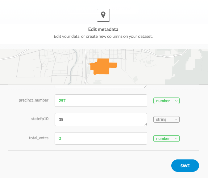
It turns out that this precinct has no votes, perhaps because it has few or no inhabitants. At some point we’ll need to figure out how to deal with this.
5. Choosing a color scheme
This is a complicated subject I don’t know much about. However, there are some helpful resources available.
ColorBrewer is a well-known tool that you can use to select and evaluate color schemes for maps. If you’re using a diverging color scheme, it’s important that the opposing colors appear equally prominent, and all of the ColorBrewer color schemes are all known to work well. I also found a tool for generating stepped gradients between any two colors.
Keep in mind that you want to keep the buckets distinct, but you may not want to use the entire range – if every single precinct was close, that’s information, and you want to display that by keeping contrast relatively low. Also, it’s worth checking the highest and lowest values for hillary_clinton_percent – you don’t need to color in ranges that never occur on the map.
I used these tools earlier to generate an elaborate stepped purple/green color scheme specifically for two-candidate primary elections, so I’m going to use that. Using 20 buckets is probably overkill and you don’t need to do it. I’m also going to change line-width to 0, because this makes it easier to see the colors when you’re zoomed out. (In an application where it was important to know exactly where the boundaries were, you would not want to do this.)

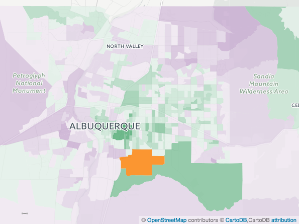
See that big green precinct at the bottom of the screenshot? If we look at the data, we’ll find it has only 25 votes. Precincts with small numbers of votes are often outliers. We can use an SQL query to view only those precincts:
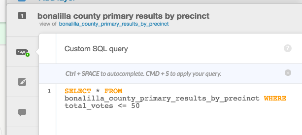
In this case there are only a few. In some cases, there are quite a lot – for example, if you’re mapping the Republican primary in Chicago, at least half the city will show up in this query. The results from precincts like this are essentially random noise. I suggest that we don’t show them:
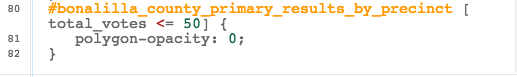
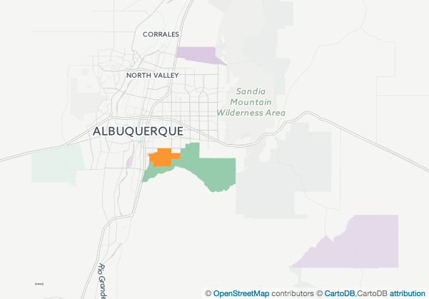
The precincts are still there, but now that we’ve set the opacity to 0, they are transparent.
6. Finishing touches
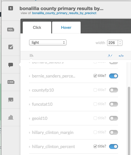
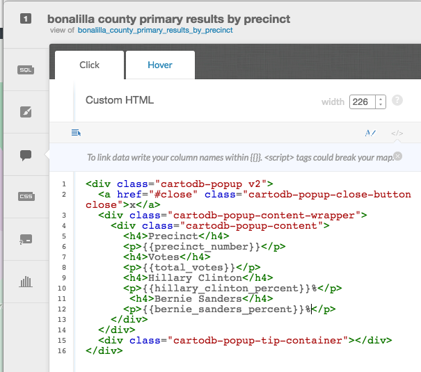
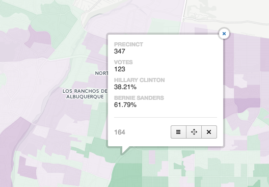
The infowindow
When your users click on a precinct, they’ll see an infowindow, which is currently empty. You can choose which fields to display in this window, then edit the HTML to customize how these fields are displayed.
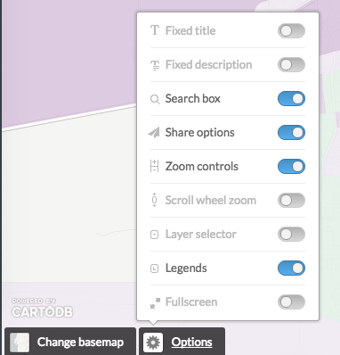
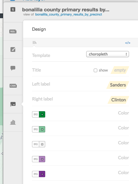
The legend
Earlier, the choropleth wizard automatically generated a legend for us. I turned it off in the options menu, but it’s still there. Let’s turn it back on, paste in the appropriate colors, and add labels:
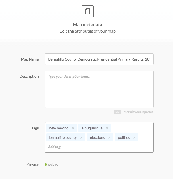
Title and metadata
Finally, let’s add a descriptive title and some tags.
And we’re done!
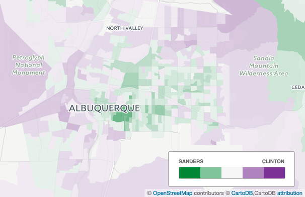
I’ve never been to this county and know nothing about Albuquerque, but I’d be willing to bet that the dark green patch is the University of New Mexico.
6. What else can I do with CartoDB?
Lots of stuff. Take a look at the CartoDB Map Academy to learn more.
7. Did I make any glaring mistakes?
If any of the above is unclear, or if you have any suggestions as to how this tutorial can be improved, please let me know.