This post is the first of an open series of posts in which I attempt to learn how to use Python data analysis tools, while simultaneously learning about US presidential elections. (Why US presidential elections? Because the data is generally easy to find, and many people genuinely care about the subject.)
Our subject today is geographic polarization – specifically, the extent to which US states differ from each other with respect to voting behavior in presidential elections.
Ronald Reagan won the 1984 presidential election by 18 points, and lost only one state (Minnesota). Barack Obama won by 7 points in 2008, and won 28 states. If we add 11 more points to Obama’s 2008 margin in every state, we find that he would only have won 7 more states, and would still have lost 15 of them. It looks like an electoral college landslide like the ones that occurred in 1972 and 1984 is now impossible, because US states have become much more heterogeneous.
Can we quantify how much this polarization has increased? How far back does this trend go? Has the US ever been this regionally polarized before? Let’s see if we can find out.
Stephen Wolf at Daily Kos has created a spreadsheet of state-by-state results for every presidential election from 1828 (when popular vote totals were first recorded) to 2012. In order to assemble the dataset we’ll be using, I copied the vote percentages for the winning candidate in every year into a CSV file, which you can view on GitHub.
There are at least two problems with this approach. First, it doesn’t provide complete information about elections with three or more candidates. I suspect that the results in 1968, in particular, will appear much more homogeneous than they should. However, I don’t know what statistical methods one could use to properly evaluate this.
Second, there are some oddities in the nineteenth-century election results. In 1828, 1832, and 1860, only the Democratic candidate was on the ballot in some Southern states. There are enough of these states that I can’t just exclude them, so the choice is to either drop those three elections completely, or code those states as 100%/0% and accept that the elections will show up as huge outliers no matter what we do. I chose the second approach. There are a few other anomalies as well, like Benjamin Harrison (the incumbent president!) having no ballot access in Florida in 1892, but they only affect one or two states in any given year, so they shouldn’t have much impact on our results.
We’ll be analyzing this dataset using pandas, a data analysis library for Python. Pandas uses two primary data structures: the Series, which is a one-dimensional list, and the DataFrame, which is a two-dimensional structure resembling a spreadsheet or a table in a relational database. We can easily convert our spreadsheet into a DataFrame:
import pandas

state_data_path = 'percent_for_winning_candidate_1828_2012.csv'
state_data = pandas.read_csv(state_data_path) \
                   .set_index('State') \
                   .drop('Washington DC') \
                   .ix[::,::-1]
After creating the DataFrame, we define the ‘State’ column as an index, so
pandas will know it doesn’t actually contain data, and drop Washington, DC
because it’s consistently an outlier. The last method call reverses the column
order, because the source file happens to be in reverse chronological order.\
These methods all return a new DataFrame rather than altering the existing one,
unless you pass inplace=True as a parameter.
Our data is now in a usable form:
>>> state_data.head(2)
           1828    1832    1836    1840    1844    1848    1852    1856  1860  \
State
Alabama  0.8989  0.9997  0.5534  0.4562  0.5899  0.4944  0.6089  0.6208     0
Alaska      NaN     NaN     NaN     NaN     NaN     NaN     NaN     NaN   NaN

...
Alaska is NaN (not a number) in these columns because it didn’t exist, but
fortunately pandas will ignore these placeholder values by default.
For the moment, we’ll define “polarization” to mean “statistical dispersion.” I know of several ways to measure this, and lack the expertise to determine which one is best, so the best approach is to try them all. If they all tell us the same thing, problem solved; if not, we can investigate further.
The best-known of these measures is variance. Pandas makes it extremely easy to obtain the variance of every column, as a Series:
>>> state_data.var()
1828    0.053327
1832    0.058698
1836    0.005559

...
Since pandas incorporates the data visualization library matplotlib, we can also plot the data rather easily. We’ll be doing this a few times, so I’ll define a method:
import matplotlib.pyplot as plt

def save_plot(series, plot_name):
    plt.figure()
    plot = series.plot()
    plot.get_figure().savefig(plot_name + '.png')
    plt.close('all')

save_plot(state_data.var(), plot_name='state_results_variance')
Calling plt.figure() is necessary because it initializes a new figure –
otherwise, when we plot more series, everything we’ve plotted before will show
up in the new figure. We then close the plot so it doesn’t continue to consume
memory. (There may be a better way to do this.) This initially confused me.
Here is the plot:
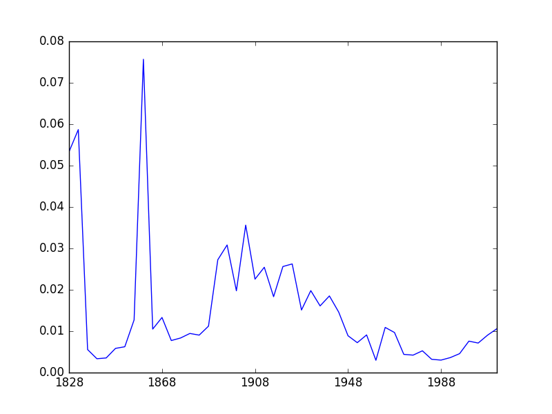
There are some spikes, but we expected those. The rest of the chart shows some potentially interesting patterns. However, there’s a potential problem here: variance is not robust. It’s sensitive to outliers. I knew enough to remove Washington DC, but there may be other outliers in earlier elections that I’m not aware of.
A more robust measure of dispersion is median absolute deviation, which is
exactly what it sounds like; we calculate how far each state is from the median,
and then take the median distance. Because pandas is excellent, we can plot this
in exactly the same way we did the variance, except by calling
state_data.mad() instead of state_data.var().
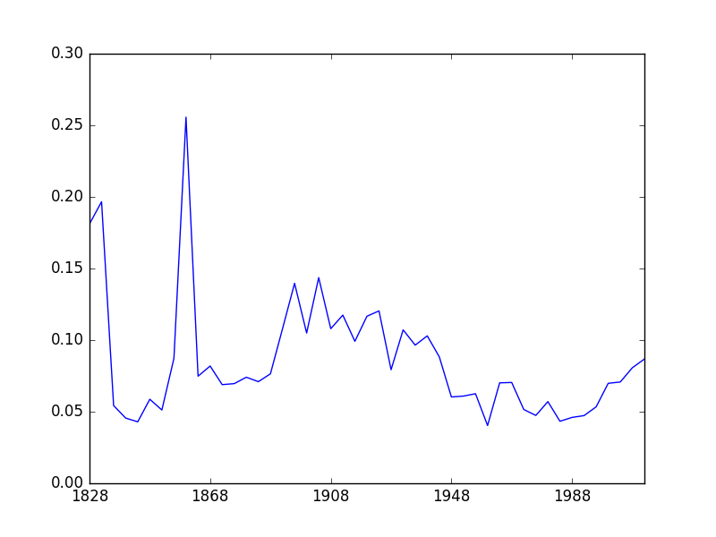
This has calmed the chart down a bit, but it’s still showing us the same basic pattern, which is good. (Note: there is actually a subtle difference here I initially missed, which we’ll discuss in the next post.) The other good thing – and this is really interesting – is that the structure of the chart seems to correspond to the standard periodization of US party politics. You might guess from looking at this figure that something important changed in 1892–1896, and you would be correct. Of course, humans can see patterns in everything, and this could be coincidence, but it seems like a strong indication that we’ve picked up something real.
So is geographic polarization increasing now? Clearly yes, but this looks like a reversion to the old pattern – polarization was at historic lows from roughly the 1940s to the 1990s. This makes sense. The subject is complex, and I can’t do it justice here, but it’s reasonably well-known that the Democratic party used to have a liberal Northern wing and a conservative Southern wing, as did the Republicans. This arrangement started to break down in the 1960s, but the parties didn’t entirely sort themselves out (ideologically and geographically) until the 1990s, or arguably even the early 2000s. We can see it happening on the chart.
There is another robust measure of dispersion, which is the interquartile range – just the difference between the 75th and 25th percentiles. Pandas doesn’t have a built-in method for this that I can find, but it’s easy enough to calculate:
def iqr(data):
    range = lambda x: x.max() - x.min()
    return data.quantile([0.25, 0.75]).apply(range)

save_plot(iqr(state_data), plot_name='state_results_iqr')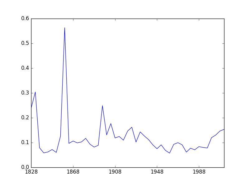
This is. . . odd. The pattern is recognizably similar, but it’s flattened out, and the relative positions of some elections have changed considerably.
In the next post in this series, we’ll try to find out why these patterns are different. This will expose two serious problems with the foregoing analysis:
- We’ve been relying on an unspoken assumption that the election results are roughly normally distributed, or at least that they all follow much the same distribution, but we never actually investigated whether this was the case. (Spoiler: nope.)
- We never clearly defined “geographic polarization.”
It would also be nice to have more readable charts where each election is readily identifiable, and maybe shade them to indicate periodization. I don’t know how to do this either, and thus it is another topic for a future post.